
Company:
Jollymour Wines
Role:
Co-Founder/Designer
Duration:
9+ Years (Jun 2015 — Present)
A shared love of wine turned into a long-term collaboration rooted in craft, story, and tradition.
Through fires, lost vintages, and pauses during COVID, we learned and refined over time.
Our first fully realized product — the 2021 Cabernet Sauvignon — was bottled after nearly a decade of iteration.
Create a wine we love drinking — one that captures the sacred, special role wine has always held in our family.
From 2015 to 2019, we worked with different winemakers, but none of the vintages met the quality we were aiming for.
In 2017, wildfires destroyed the harvest, and in 2020, COVID paused production entirely.
The winery we rented space from was eventually bought out and gutted — a reminder that in Napa, small producers like us operate in a landscape built for billionaires.
Still, we stayed focused on what we could control: the quality of our grapes, our process, and our persistence.
As the wine took shape, so did our vision for the brand: bold, classic, and deeply personal — just like the Cabernet we were crafting.
We built the identity around a timeless Napa aesthetic that would appeal to seasoned wine drinkers, using rich tones and refined typography to mirror the depth and sophistication of the wine itself.
We wanted an elegant cursive script to reflect the sophistication of the wine’s profile. While experimenting with various typefaces, we landed on Milton Two Bold.

I custom-edited the script for the Jollymour logo, ensuring it aligned perfectly with our desired aesthetic.

We explored floral and vine motifs early on but ultimately stripped them away to keep the focus on the name.

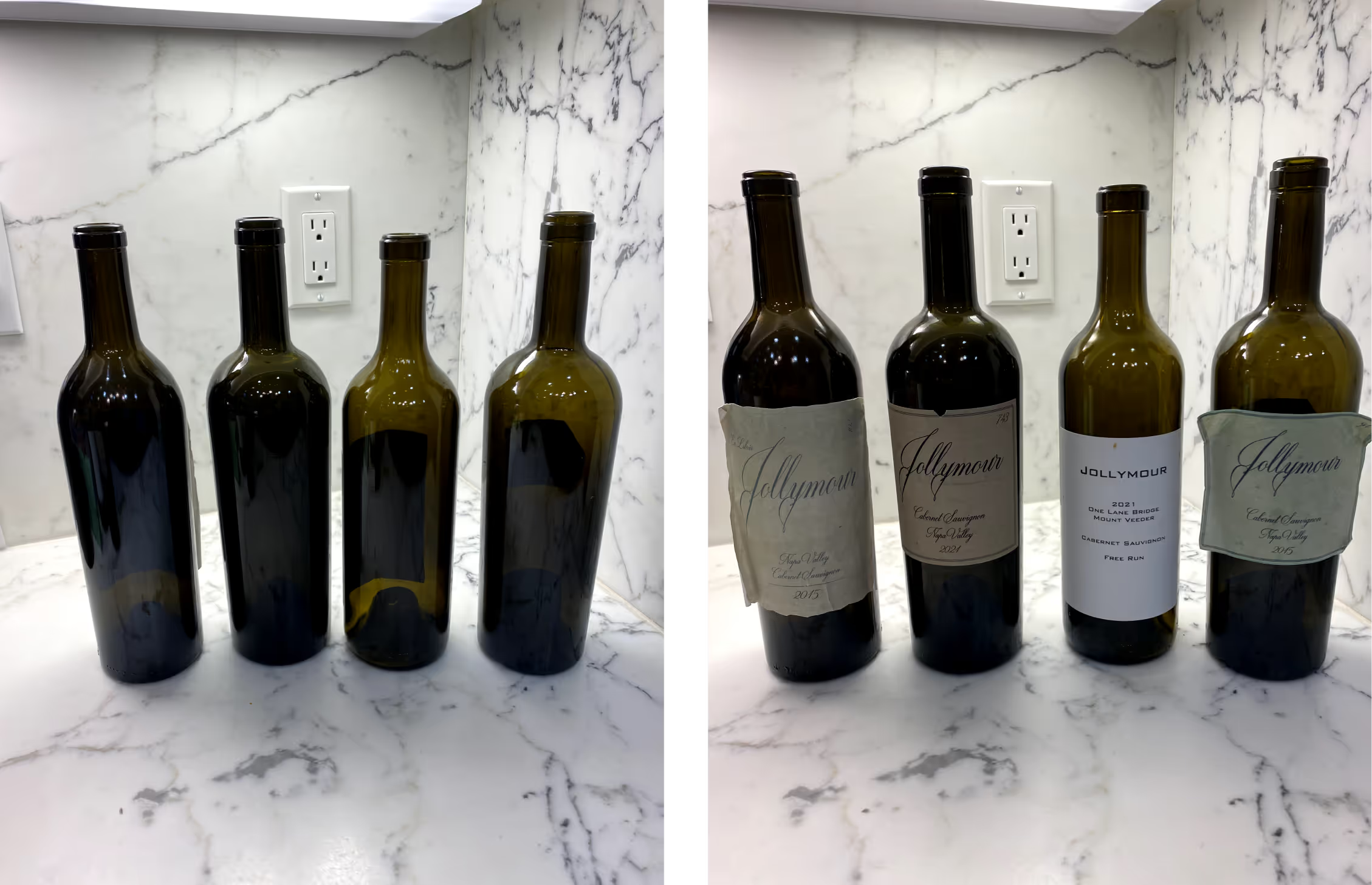
We began by exploring textured backgrounds inspired by worn, older paper, setting the tone for a timeless and elegant label.

To reflect the wine as part of a personal library, we developed an “ex libris” concept, representing the label as a page from the vintage’s book.

Details like a dog-eared corner and page numbering were added to signify each bottle’s uniqueness, emphasizing the personal, handcrafted nature of the wine.

While the “ex libris” theme felt unique, we decided it was too literal. We refined the label by balancing elements and removing the book-like details, while retaining the bottle numbering to maintain a special, personal touch for each bottle.

I also experimented with the aesthetic and layout of the back label, abiding by all the legal requirements for a wine label.

We tested different shades for the label’s texture and applied the designs to digital bottle mockups. This step helped visualize how the final product would look and guided further refinements.

Selecting the bottle was another critical step in defining the brand’s physical presence.
We chose a tall, hefty bottle with bold shoulders, mirroring the rich, bold depth of the wine.
The bottle’s weight and structure ensured it stood out as a statement piece, complementing the wine’s profile.
We knew we wanted a black capsule that drew minimal attention away from the main label.
Because of the smaller form, the whole "Jollymour" would be too small to read, so we opted for simply the "J" on its own.
Subtle, black on black coloring accomplished understated, classy additional branding.

Once the bottle design was finalized, I worked closely with a printing company to select label materials that matched our vision.
This involved creating proofs for dyes, embossing, and foil finishes to enhance the label’s tactile and visual appeal.
Specific dimensions were tailored to the chosen bottle, incorporating a slight taper for a seamless fit.

The website mirrored the brand: dark, rich, and minimal — placing the wine front and center.
Our story unfolded across the site, inviting visitors into the journey and making the family connection feel tangible.
Set against a black background, the bottle became the focal point — elegant, confident, and personal.

In 2021, after years of refinement, restarts, and setbacks, we finally bottled the wine we had envisioned from the start.
Like a grapevine, growth came through resilience — from lost vintages to production halts, every challenge shaped the final product.
In 2025, that journey was honored with a Double Gold at the San Francisco Chronicle Wine Competition — a validating milestone for a project rooted in care, patience, and persistence.
Jollymour Wines stands as a personal symbol of what it takes to build something meaningful.
Every detail — from the bottle to the website — was designed to reflect the wine’s essence: deep, rich, and well-rounded.
The process took time. But it was worth it.
