


Company:

Role:
UX/UI Designer
Duration:
3 weeks (Jun 2023 — July 2023)
UC Berkeley UX/UI Bootcamp capstone final design project
Collaborated across research, ideation, testing, and high-fidelity design.
5 interviews + 27 surveys from both hearing-impaired and non-hearing participants
Make live communication more accessible, clear, and inclusive for people who are hearing impaired.
One of our teammates has a hearing impairment, so it was natural to work on something close to home.
They shared how difficult it can be to fully participate in conversations, especially in group settings or noisy spaces.
We wanted to design a tool that could help others in similar situations feel more present, connected, and included.
We conducted 5 interviews and surveyed 27 people, including both hearing-impaired individuals and those without hearing challenges.
We wanted to understand both sides of everyday communication.
The problem was the feeling of missing connection, clarity, and inclusivity.

mishear in lectures or formal meetings

always use closed captions

generally mishear people
People wanted a captioning tool that felt natural, something that helped them stay in the moment, not stand out.
We realized that if Echo distracted from the conversation, it wouldn’t just interrupt the flow, it would make the user feel self-conscious about their hearing difference.
That kind of attention would add discomfort, reinforce stigma, and ultimately make people less likely to use it.
Echo needed to work quietly, unobtrusively, letting users focus on the conversation, not the tool.
Echo needed to support the conversation, not distract from it.
We chose to design Echo as a mobile app because it’s the most accessible tool people already carry with them.
Everyone has a phone, it’s discreet, portable, and already equipped with everything we needed: a microphone, screen, and the ability to run anywhere in real time.
Making Echo mobile meant it could support conversations wherever they happened, without extra hardware or setup.
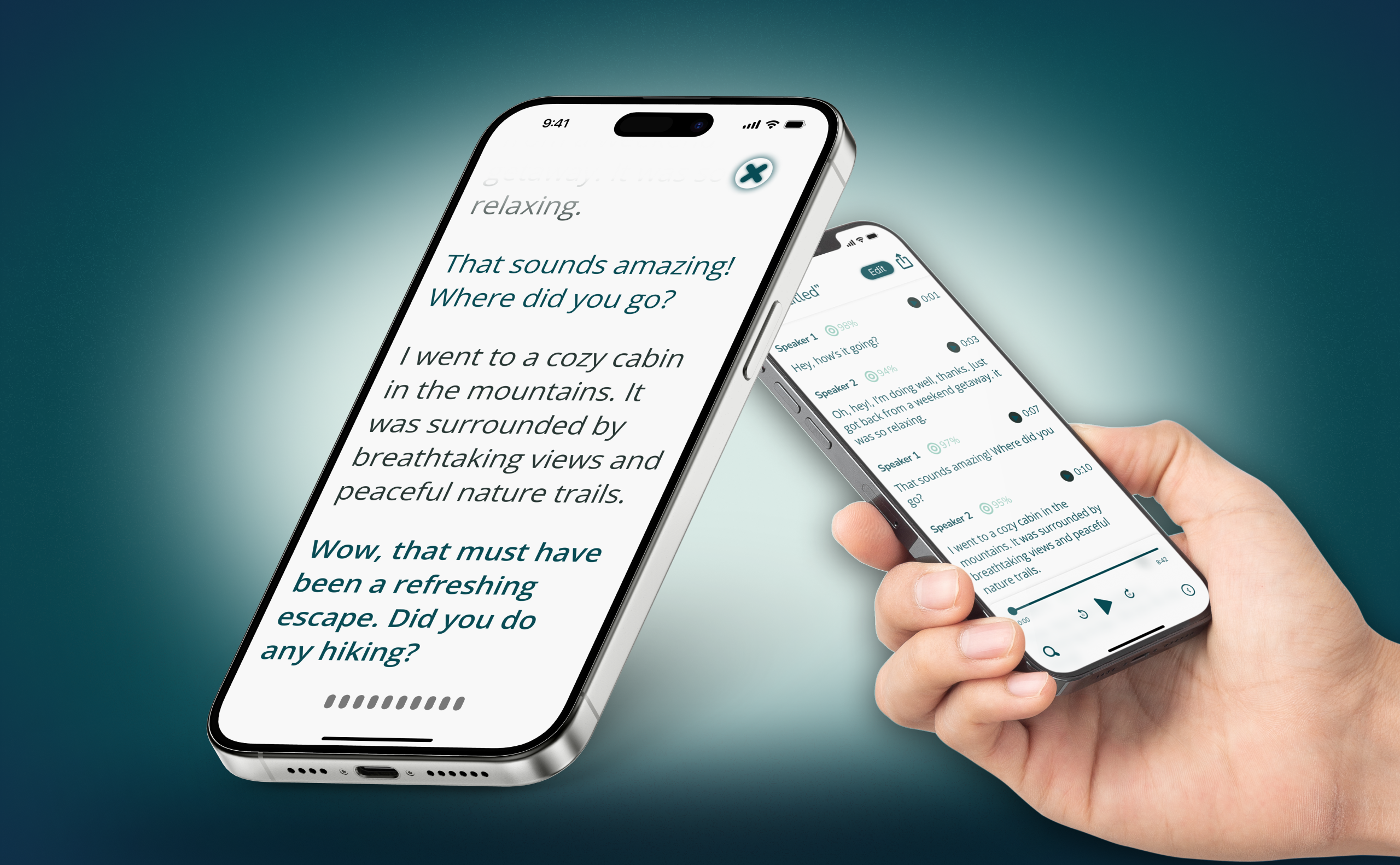
We began by outlining the core experience: live captioning, transcript saving, customizable settings, and a clean, unobtrusive UI.
The first round of wireframes explored key screens, including how users would start recording, view captions, and access saved conversations, with a focus on simplicity and minimal visual noise.

Alongside the wireframes, we mapped out the full user flow, from launching the app to adjusting preferences and reviewing past transcripts, to ensure Echo could support both real-time use and post-conversation reflection.

We tested our early prototype to evaluate clarity and usability in real conversations.
The goal was always the same: Echo should support presence, not pull attention away from it.
Through testing, we identified key areas to improve:
Reduced visual clutter on the dashboard
Added more descriptive information to settings functionalities
Refined the transcript screen to have a focus mode to be easily scannable and distraction-free

To enhance accessibility, settings like font size and color customization helped users tailor readability to their preferences.
We included saved transcripts so users could revisit conversations: a key insight from our research showed that users often hesitate to ask for clarification.
We designed both light and dark modes so the app could be used in different settings, without drawing attention.

Echo let users stay present in conversations without falling behind.
They could follow along in real time, on their terms, with minimal friction.
It turned spoken communication into something accessible, private, and empowering.
In addition to product prototyping, we designed a website landing page to explore how Echo could be presented as a brand.
It was a way to showcase potential marketing materials and convey our mission of making communication more accessible and inclusive.

This was the first time I designed something deeply personal and truly essential.
It showed me how perception, accessibility, and empathy translate into product decisions.
And it reminded me that great design should disappear, making space for connection, not just interaction.
Echo was never just about displaying words.
It was about making people feel included, heard, and at ease in any conversation, anywhere.
That’s the kind of design I want to keep building.
I’d explore wearable support like Apple Watch integration.
I’d improve voice isolation to increase captioning accuracy in noisy settings.
And I’d refine onboarding to help first-time users feel comfortable and confident from the start.

